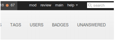
Can we have a link in the header on this site (the mathematics meta site ) to the main (mathematics site), just a simple link will do, it is just to make swiching between them easier.
1 Answer
Speaking as someone whose job frequently involves flipping back and forth from the meta site and the main site, needing to use two clicks to go in either direction is bothersome. We added it to the "help" dropdown in the top right to make a more consistent option than the top left, but it's still two clicks.
Mad Scientist is right, though - in its design, we don't really have room to comfortably link to the main/meta site in the top bar directly. When you've got enough status...

...it starts to get crowded. We want to keep the design in such a fashion that it shouldn't break readily, so even though technically I could see enough space for fitting the word "main" or "meta" up there in the given image, that would possibly cause issues when someone gets even more rep and more badges (as some folks do). I could also bore on details on whether or not "meta" is meaningful as a word to new users, but I think that's getting too bogged on reasoning.
End result is that with this design direction, it is unlikely that is going to change in the native system itself. Manishearth, however, wrote this script to add a Main link to the top bar when viewing any Meta site, as illustrated in this image:

Installation instructions for scripts can be found here. Note that if you have a lot of top stuff from being a moderator with a lot of rep and badges on a site with active flags and suggested edits... the script will cause some clashing and overlap of elements in this scenario. Otherwise, it should be pretty clean to use.
-
1$\begingroup$ How about hiding your reputation score on meta in order to make room for the main site link as some kind of escape hatch? Alternatively, it could even replace "review." $\endgroup$– badpCommented Feb 24, 2014 at 17:23
-
$\begingroup$ @badp Part of the design of the universal top bar is visual UI consistency, especially within one site - I won't discredit making a script that removes said elements but removing it in the system itself is a non-starter. Your rep is still used on Meta, review is still a thing that can be done on Meta. I've thought of other ideas like rolling tools/mod/review into a dropdown instead of needing them separate, too - I'd actually more prefer that kind of route, sometimes, but then that'd make mod tools more annoying to access. $\endgroup$ Commented Feb 24, 2014 at 17:30

mainin the topbar. But then the topbar was redesigned. $\endgroup$