Some SE users, including myself, like experiment with the data in the SE system, looking for patterns, visualizing trends and so on. The data explorer is a fantastic tool, which allows users with little (or no) knowledge of SQL to obtain desired information from the system, download it, present it graphically, etc.
That said, I do not think that SE developers should be charged with building data visualization into the site's user interface. Some of us like word clouds, some like pie charts, some like multi-colored 3D stacked columns and whatnot. Each of us can download the data, put into the favorite visualization software, and enjoy the result.
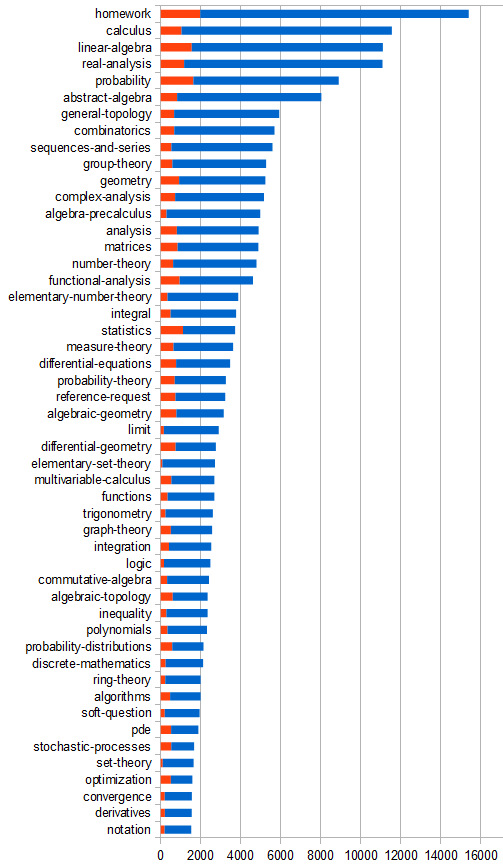
For example, I happen to be interested in Unanswered questions, so I find this chart more useful to me right now than any cloud: top 50 tags by the number of questions, with the unanswered in red.

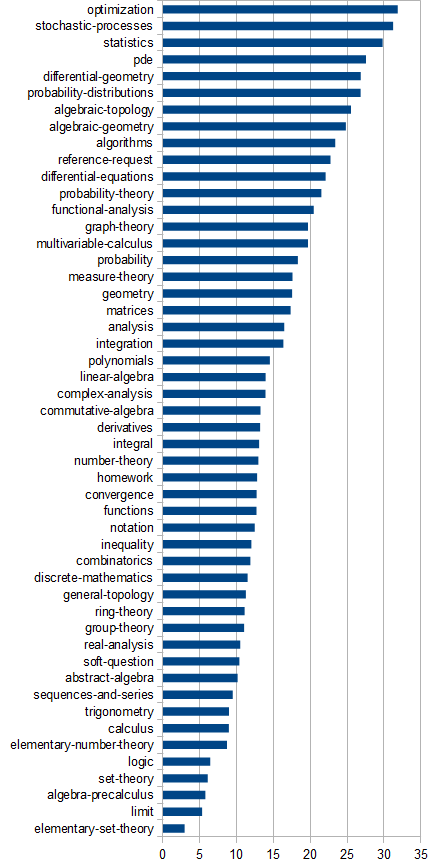
Source: Unanswered Questions by Tag. Also ordered by the % of unanswered questions:


div..., sees a suggestion division-algebras, and clicks that happily without checking. Thus the said poster has inadvertently jumped from high school level straight to graduate school. Would your suggestion help reduce this problem? Would it actually make people read the tag description before grabbing the first familiar word? $\endgroup$