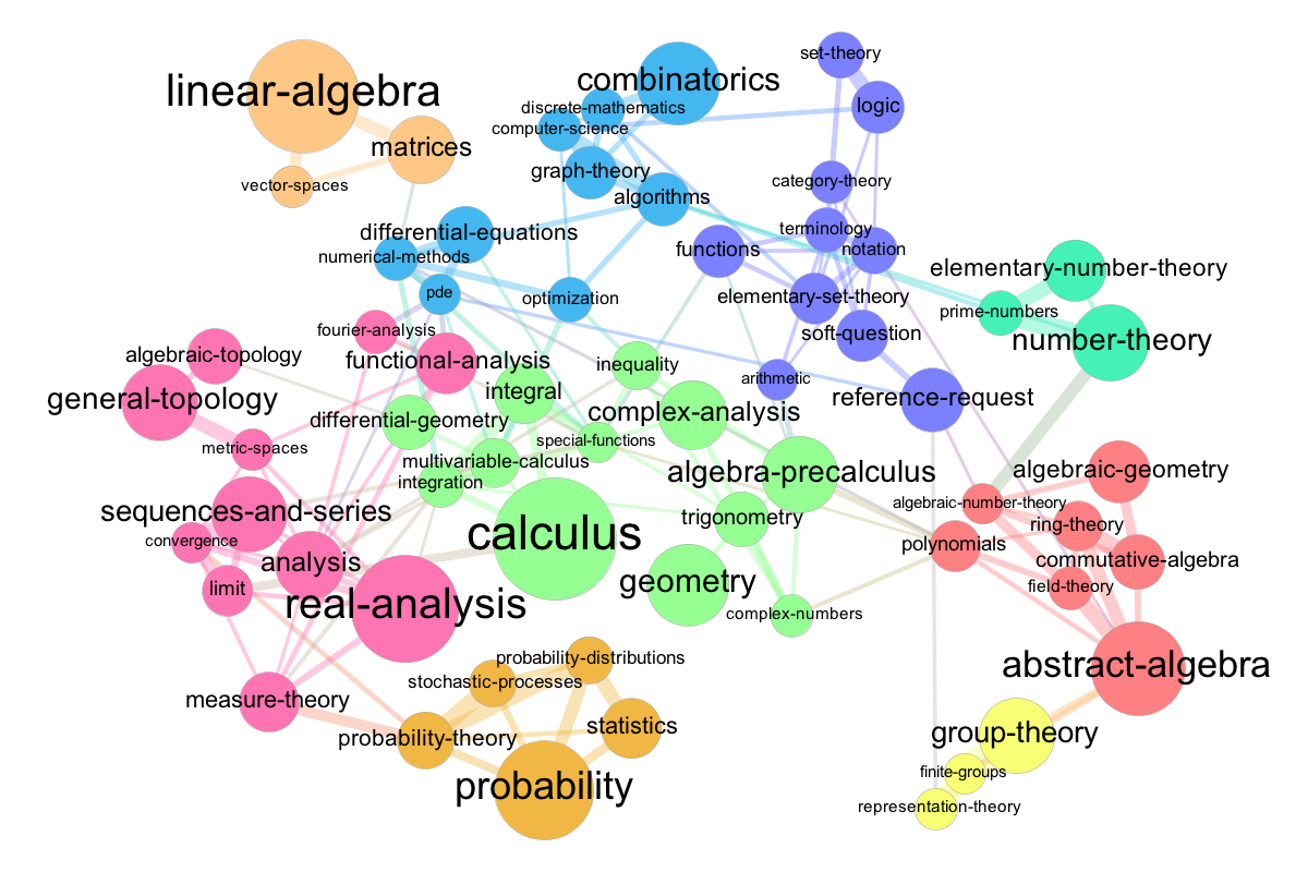
I've just made a map of tags for Math.SE. (And to some degree - a greatly simplified map of mathematics.)
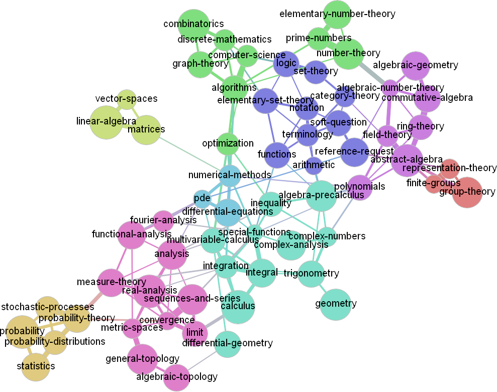
In short: tag size is related to tag popularity (caveat: see below) and edges are related to tag co-occurrences in questions (or more precisely: the observed/expected ratio, see About joint probability divided by the product of the probabilities). Colors are to distinguish graph communities, as detected by this algorithm.
For me it looks as a "snapshot" of topics and scope of this SE site. So if you want to use it in any way to promote Math.SE - feel free!
Also, if you have comments how to improve its usefulness or niceness to our community, I would appreciate them (but bear in mind that I have no color esthetics).

Caveat: I plotted all of 64 most popular tags that have at least one link, that is, 63 tags. As I see now, homework (the most popular tag) went out. Lousily speaking, it means that this tag doesn't co-occur with other tags "much more than on random". Do you think that I should attach it as a separate node? (Alternatively, I can lower the threshold, but then (almost) everything is going to be linked with almost everything, hardly making in any clearer.)
Edit:
I added one more visualization, this time a bit less dense. Based on Gephi - OpenOrd:

Links:
- An entry for StackExchange vis competition at Kaggle (please vote if you like it :), it ends on the 3th of Nov 2012)
- Recipe, code and images at GitHub (e.g. tweak the plot to your taste; feel invited to co-develop)

